Actually, things aren't that bad.
NHL fans had to live through some truly ugly uniforms throughout the 90's and 00's but with the Heritage craze thankfully taking over, we are seeing less black, less navy blue and more of the bright primary colours that were popular before Gretzky went to LA and wore the new black and silver Kings theme that went on to sell a million jerseys and taking hockey fashion to boring depths never breached before.
That era is coming to an end but there are still some sweaters that would best go the way of the the Islanders Captain Highlander experiment.
I'm sure people will vehemently disagree with some of my choices, so let me have it if you feel that way.
Okay, here we go. Five worst uniforms in the NHL today:
1. Anaheim Ducks 3rd jersey
The Ducks regular uni's are merely boring, drab and uninspired. These are straight up brutal. Where do we start? First off, I like orange on uniforms if done the right way (Philly obviously). Bright colours look good on TV and nothing pops better in HD than orange. But this uni is a bit of a Frankenstein. Look at the socks. Looks like a failed home economics project where the clearly failing student randomly sewed together two different socks from two different teams. Why not just go with an orange stripe instead of going half and half?
Then there's the already dated vertical slashes under the arms, the horrid piping along the shoulders and the meaningless, utterly forgettable logo on the front. Why not just go back to the duck mask? At least that had character.
2. Dallas Stars home and away
What's the point here? They're barely even trying. There was a spate of uni's after the lockout that were so plain they looked like pajamas (the worst being the Oilers white sweaters which they have mercifully discontinued). These plain Stars uni's are almost impossible to discern on TV. The Stars have a decent logo but it's hanging out on the shoulder where no one can see it and their best colour - green - is now pretty much a complimentary shade.
You can't even make out any green on these black home duds. It's bad enough there's no stripe along the waist, but plain black pants? Who designed this crap? The Undertaker?
3. Colorado Avalanche home and away
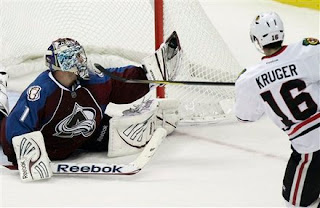
The Avalanche actually have a good color scheme, which is distinctive in a league full of black, red, blue and more black. But you couldn't really come up with a worse design than this. I look at the shoulders and it reminds me of a bad spacesuit. How many sections is this jersey made of? The piping down the front makes this look like a barbecue apron. It's got that ugly neckline that makes the players look like they're wearing a pendant around their necks. There's not an inch of tradition here and that makes these look cheap and dated.
The home darks are only marginally better. That being said, their 3rd jerseys are among the best in the league. How do they not go with these full-time?
4. Edmonton Oilers 3rd jersey (former home jersey)
Again with the pajamas. Or practice jerseys. Whatever you want to call them. One of the best logos in the league on the one of the worst uniforms of the past decade. Half-stripes on the underside of the elbow, the dreaded apron piping, no stripes on the waist, zero colour. A sad time for the Oilers. Thankfully they have reverted back to their Gretzky-era uni's but for some reason they've kept this disaster as a 3rd. Their now extinct white counterparts were even more boring. Against the ice, it was like watching invisible men.
5. Los Angeles Kings 3rd jersey
The Kings uniforms have been a mess since 98-99 when they dropped their Gretzky-era black and silver (which I was never a huge fan of either) and adopted various versions of black and purple with the city's name spelled out on the waist. This dud has survived the war of attrition and will be worn a few times this year. The Kings have never been able to get their look dialed down and watching the Kings for the past decade has been depressing if you're a jersey hound. Looks like that is going to continue in a rather dumbed down black and silver uniform that still doesn't seem quite right to me (but at least they look kinda mean now).
To end on a bright note, the Kings do have one of the nicest heritage jerseys in the NHL with this beauty. Too bad we only get to see it a handful of times. When I see these, I think LA hockey - Marcel Dionne, Charlie Simmer, Bernie Nicholls.


2 comments:
First off, I thought that the Gretzky era Kings jerseys were pure gold. Especially the 1988-89 ones. I loved them.
Tough to argue with your list. These unis are brutal. I don't think the Ducks have ever had a decent jersey. Kinda feel bad for their fans. But then again, it's all opinion, so maybe the folks in Southern Cal like their unis. The sun can make you think different, right?
I grew up hating the Habs, but lately I've really started liking the jersey. It's simple, it's clean, it's classic ... it just works.
The Preds new yellow jerseys are my pick for worst.
Post a Comment